Thursday, June 12, 2014

The valid ways of Online Earning, you should know before try


Now a days online earning is a passion to most of the internet users. But the beginners don't know how to start and where to earn money. First of all, I am ensuring that it's true that you can earn money from online. A lots of people are earning. Look around you, there may be someone who is also earning from online. But you should remember that it's not too easy. There are several ways for online earning. The best and reliable three are described below shortly.

1. Freelancing
The most popular way of earning money from online is freelancing. People who earn money by freelancing is called freelancer. A freelancer should be skilled on a specific subject e.g. website designing, programming, graphics designing etc. to earn money. Freelancer have to bid to get a job from the marketplace. www.freelancer.com and www.odesk.com are two most popular marketplace to get thousands of jobs.

2. Google AdSense
AdSense is another best way to earn from online. The earner who earns using Google AdSense program is known as AdSense Publishers. The publishers have to publish AdSense Ads on their (publishers) websites, or over their uploaded videos, or into the apps they have designed. Publishers like me earn when someone click on the ads showing in their content. Some people earns a huge amount using Google AdSense Program.
online earning,earn money online,earn from internet
3. As a Re-seller
You may also earn money online as a re-seller. Then you have to sell others products or services and you will get a percentage depending on your selling. Some people in Bangladesh earn money by re-selling domain and hosting. And in other countries people sell others products and get paid. Amazon is one of the burning examples of this types of business. You may earn by re-selling Amazon's Products.


Get a verified Google Plus Profile or Name


Google Plus also offers Verified Profile for the Users as like as Twitter and Facebook. Both of Facebook and Twitter provide verified profiles and pages for the Celebrities or Public Figures. Verified Account is really so essential for the product and public figures. Because, there are lots of people who pretends to be a Celebrity.

They do it to draw others attention, so that lots of people follow them. Google Plus has also started to provide Verified Profile or Verified Name. But there is no way to apply for it. Google Authority will contact with the users if they found the expected number of followers are following them. But Google hasn't declared that expected number of followers. So, if a huge amount of Google Plus Users add someone in their Circle then he / she may also get a Verified Profile or Name.
verified Google plus profile,g+ profile verified,verified name in Google plus
If you found a tick mark showing next of one's name then hover over the tick mark, you will see a message showing Verified Name. Thus you may be confirmed about a Verified Google Plus Profile.
Some Important Points to Note About Google Plus Verified Profile
  1. There is no way to apply for this Verified Profile
  2. Only Celebrities, Public Figures and People with a huge numbers of Circles are eligible for this
  3. Google Plus is new in this section and yet working to develop it properly
  4. Google Plus Team will contact with you if they found you are eligible for this verification. So you needn't think about it. Just add more and more people to become familiar
  5. A Tick Mark will be available at the next of the Profile Name if he/she is verified
  6. After hovering the mouse pointer on the Tick Mark you will see a message saying Verified Name
  7. After being verified you have no right to change the Profile Name even a single character. If you do so then your verification will be reset. That means you have to be re-verified again.


Tuesday, June 10, 2014

Why Google AdSense will Pay Me...?


What is AdSense?
It's a way of earning money from online showing Google Ads on websites, videos and games.

Who can earn?
-People who has a website that comply with Google AdSense Rules and Regulations
-Owner of videos of expected number of viewers
-Designer of Games or Android Apps

How it works?
Google lets the website owners, video uploaders, games and apps designers to earn their livelihood and even more. Google pays the publishers for showing Google's Ads in / over their content. Google collects Ads from different advertisers and then Google shows the Ads into the Publishers Content. The Advertisers pay Google for showing ads on different websites etc. The Advertisers have to pay according to the number of clicks on their Ads or for a targeted number of reaches.
google adsense,online earning,earn money
Suppose, you are an Advertiser and you want to show your ad on Google’s Publishers Sites. Then you have to budget a fix amount for a numbers of clicks. You may budget 10$ for 100 clicks. Then the Cost per Click (CPC) will be (10$/100) or 0.10$. So, you are paying 0.10$ for every single click on your ad. So the publishers will get 0.10$ if anyone click on your ad showing on their sites.  And when 100 people will click 100 times on your Ad then your ad will be closed. Google take about 32% of your budget and the rest 68% is for the publishers. Thus Google earn lots of money every day from AdSense Program. Google AdSense covers almost 28% of Google’s annual earnings.

Let’s know why Google will pay you
  1. Because, you will show others ads on /over your content and Google will earn money if any of your visitors or viewers click on those ads.
  2. Google will give you the 68% of the earning and they will keep the rest 32%. So Google is also earning by you.
  3. Google AdSense covers almost 28% of Google’s total earnings and all of these mainly come from the publishers. So they earn their major percentage from this program.


Sunday, June 8, 2014

Responsive Menu 03: Make the Menu Responsive adding Some More Codes


In the previous post we customized an unordered list and learned to make a menu. Now we will add some more codes to make the menu responsive. The Responsive Menu is a menu that response/change differently depending on the device and the screen size. When the site will be opened on the expected device/screen then the Responsive Menu will appear differently but the functionality will remain same. Follow the steps below to make the existing menu responsive.

 Step 01  Add Some More Codes after the Existing Codes
Open the css file menu.css and add the following codes given below after the existing codes. These codes will give a different look when the display size will be 600px or less than it. 

@media (max-width: 600px) {
   #menu {
      text-align: left;
   }

   #menu li {
      display: block;
   }
}

 Step 02  Save the Work and Get the Responsive Menu
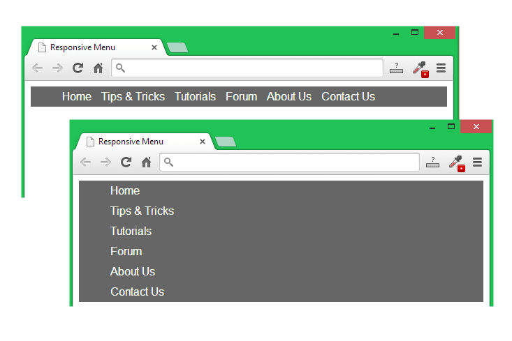
After adding the above codes into the menu.css file, save that and reload or reopen the menu.html file. Now the menu is able to response depending on the display size or the devices. Look at the image given below, there are two images- one is taken when the display size is more than 600px and the another on is taken when the display size less than or equal to 600px.
When the display size will be normal as like as a Computer Display, then the menu will work as like as all other normal menu. But if the site determine that the display size is less than or equal to 600px then the menu will appear differently as showing in the above image. Then the menu will be a Drop Down Menu.

In the next post we will add a clickable button for the menu which one will appear only when the display size will be less than or equal to 600px. And then all the menu will disappear except this button. When someone will click on that button, then the menu will be available.

Later we will add some simple JavaScript Codes to add some effect like toggle, slideToggle or sliding.

Responsive Menu:
1. Responsive Menu 01: Basic Structure of a Website
2. Responsive Menu 02: Adding CSS to Change an Unordered List into a Menu
3. Responsive Menu 04: Adding a clickable button to the responsive menu
Feel free to contact with me for any assistance...


Wednesday, June 4, 2014

Responsive Menu 02: Adding CSS to Change the Unordered List into a Menu


In the previous post we have just created a simple unordered list. Now we will customize the list using CSS to make an effective menu. Later we will change it to a Responsive Menu that will response differently depending on different types of display size of the visitors. We will work with the existing codes we used in the previous post. Lets follow the steps given below.
css menu,slider menu,responsive menu
 Step 01  Link a CSS Stylesheet with the menu.html File
First of all open a new text file and save it as menu.css (must with .css extension), then open the menu.html file in a text editor and add the new line <link rel="stylesheet" type="text/css" href="menu.css"> before the closing </head> tag.

 Step 02  Add an Attribute id for the ul tag
Now add an attribute id with the value menu for the <ul> tag. That means the tag <ul> will be changed to <ul id="menu">. We will add this attribute id, so that we can target the unordered list to customize. I have used menu as the value of the attribute id, but you may use anything you like. Now save the html file menu.html finally.

After linking the menu.css style-sheet and adding the attribute id for the <ul> tag, the total codes will look like...

<!DOCTYPE html>
<html>
   <head>
      <title>Responsive Menu</title>
      <link rel="stylesheet" type="text/css" href="menu.css">
   </head>
   <body>
      <ul id="menu">
         <li><a href="#">Home</a></li>
         <li><a href="#">Tips & Tricks</a></li>
         <li><a href="#">Tutorials</a></li>
         <li><a href="#">Forum</a></li>
         <li><a href="#">About Us</a></li>
         <li><a href="#">Contact Us</a></li>
      </ul>
   </body>
</html>

 Step 03  Change the Background Color of the Menu
Open menu.css file in a text editor and type the following codes given below. Look I have used #menu to target the ul where we used the value menu for the attribute id. So the background color of the unordered list will be changed for the codes given below.

#menu{
   background-color: #666;
}

Save the css file and open the menu.html file in a browser. You will get a background like the image below. That means, we are succeed to target the unordered list set.
responsive menu,mobile menu,flexible menu

 Step 04  Lets Show the List in a Line
Again add some more lines after the above codes to display the list in one line. The codes you need to add is given below...

#menu li{
   display: inline-block;
}

After adding the above codes, save the menu.css file and reload the menu.html file. Now the menu will look like the image given below.

 Step 05  Lets Format the Anchor Text
Add some more codes given below to get a better look. By the codes given below, actually we will format the anchor text.

#menu li a{
   text-decoration: none;
   color: #fff;
   padding: 5px;
}

After adding the above codes into the menu.css file save that and reload the page menu.html. You will get the following change as shown in the image below.
css tricks,css menu,styling anchor text

 Step 06  More Customization to Add Some More Space
In the above image, the menu is looking too thin. That's why we will add some more space to make it more thicker by adding some padding.

padding-top: 5px;
padding-bottom: 5px;

We need to add the above two lines after the line display: inline-block;. Now save the CSS file again and reload the menu.html file, you will get the following menu given below.
mobile menu,website designing,formatting list

Finally, all the codes for the menu.css file will be...

#menu{
   background-color: #666;
}

#menu li{
   display: inline-block;
   padding-top: 5px;
   padding-bottom: 5px;
}

#menu li a{
   text-decoration: none;
   color: #fff;
   padding: 5px;
}

#Responsive Menu:
1. Responsive Menu 01: Basic Structure of a Website
2. Responsive Menu 03: Make the Menu Responsive adding Some More Codes


Responsive Menu 01: Basic Structure of a Website


What is Responsive Menu?
Responsive menu is a different type of Navigation Menu that responses differently according to the screen size of the visitor's devices. When someone will visit it in a laptop or desktop, then it will act like a normal menu. But if anyone visit it using a Tab or Mobile Phone, then the menu will be re-sized and re-designed automatically.
css menu,slider menu,toggle menu
Things you need to start
1. A text editor like Notepad++, Sublime Text, Aptana Studio, Dreamweaver or simple Notepad.
2. Zero knowledge about HTML, CSS and JavaScript.
3. But importantly you need few minutes and patience. :)

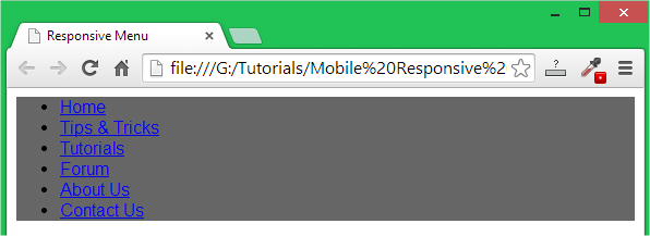
Lets see the codes given below. It's the basic structure of a simple webpage where I have added only an unordered list into the body section. The codes will create a list only as shown in the image below. Type the codes or copy and paste them into a text editor, then save that file as menu.html Finally open that .html file with a browser software. Lets know how to save a text document as an HTML file.

<!DOCTYPE html>
<html>
   <head>
      <title>Responsive Menu</title>
   </head>

   <body>
      <ul>
         <li><a href="#">Home</a></li>
         <li><a href="#">Tips & Tricks</a></li>
         <li><a href="#">Tutorials</a></li>
         <li><a href="#">Forum</a></li>
         <li><a href="#">About Us</a></li>
         <li><a href="#">Contact Us</a></li>
      </ul>
   </body>
</html>

The Codes you need

responsive menu,mobile menu,tab menu
The result of the above codes

Description of the Above Codes
<html> is the opening tag to tell the browser that it's an HTML document.
<head> is to define the header section.
<title>Responsive Menu</title> is responsible to set a title for the webpage.
</head> closing tag for the opening <head> tag.
<body> All the visible part will start after the <body> tag.
<ul> to create an Unordered List.
<li> to grab the single part of the list.
</ul> to end the Unordered List.
</body> to end the body part.
</html> to close the <html> tag.

#Next Posts:
1. Responsive Menu 02: Adding CSS to Change an Unordered List into a Menu
2. Responsive Menu 03: Make the Menu Responsive adding Some More Codes